
- Using Colour in the Garden
Creating Mood and Harmony


A garden is never simply planted. It is designed with intention, shaped by light, season, and colour. Every bloom plays a role, and together they form a living canvas that changes from morning to evening and from spring to autumn. Colour is one of the most powerful tools a gardener has. It influences how large a space feels, where the eye travels, and even how relaxed or energised we feel when we step outside. When understood and used thoughtfully, colour transforms a collection of plants into a harmonious, expressive garden.
Understanding Colour Relationships
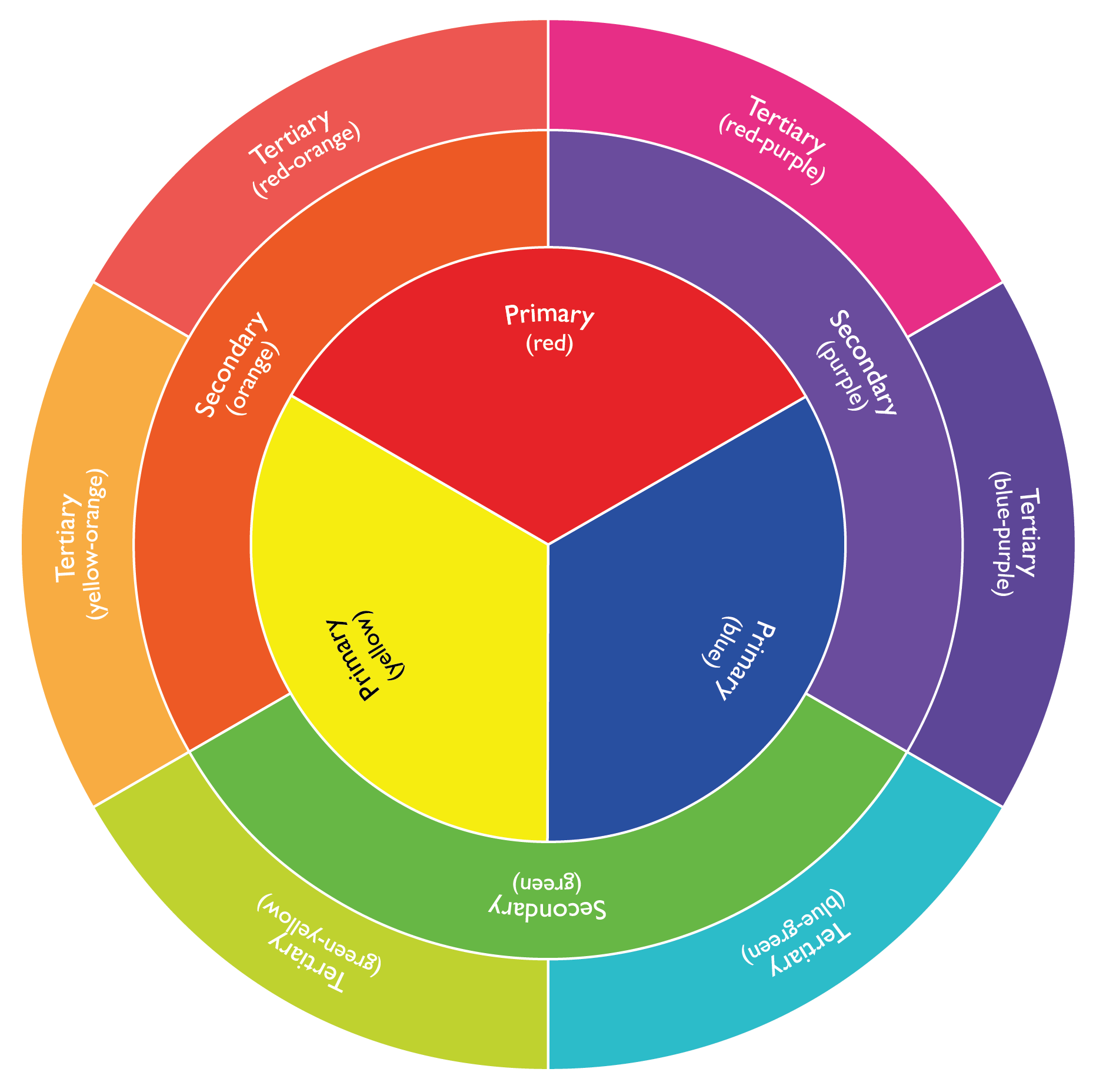
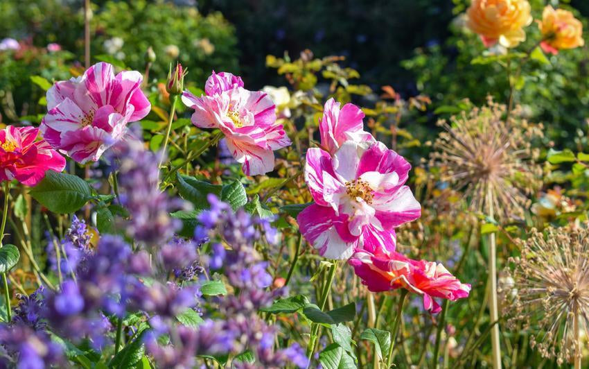
Colour design begins with the colour wheel. While simple, it reveals how colours interact and why some combinations feel pleasing while others feel bold. Primary colours, red, yellow, and blue, form the base. Secondary colours such as orange, purple, and green are created when primaries blend. Between them sit tertiary shades like peach, coral, and lavender. Gardeners can use these relationships to create contrast, flow, or unity across borders and beds.
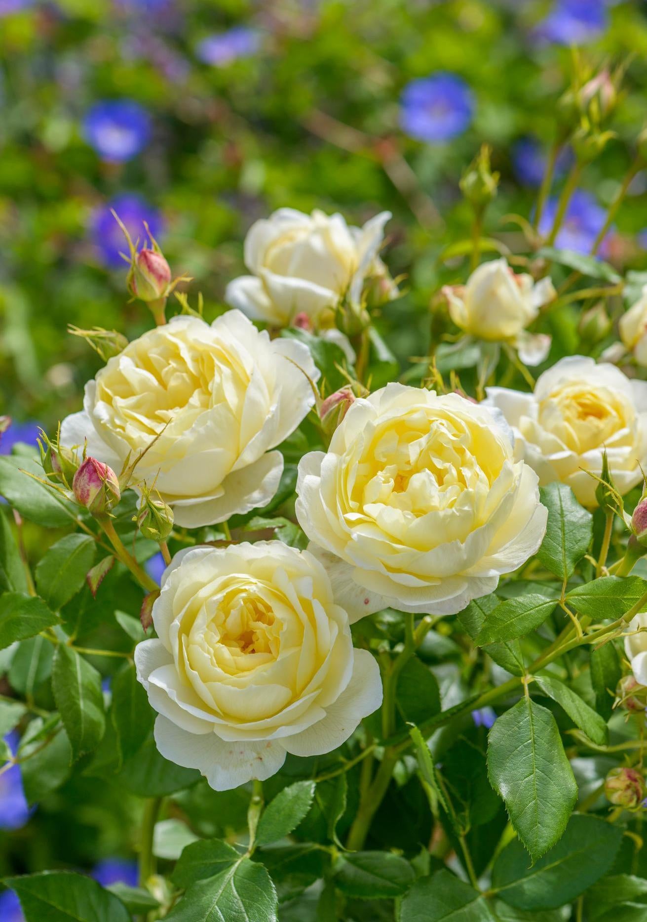
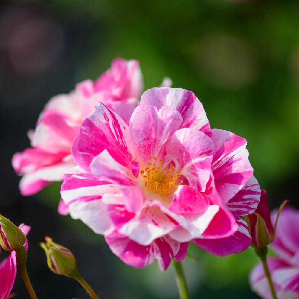
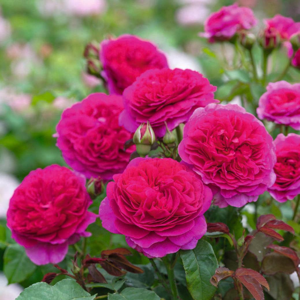
Complementary Colours: Creating Impact
Colours opposite each other on the wheel intensify one another. When paired together, each appears brighter and more defined.
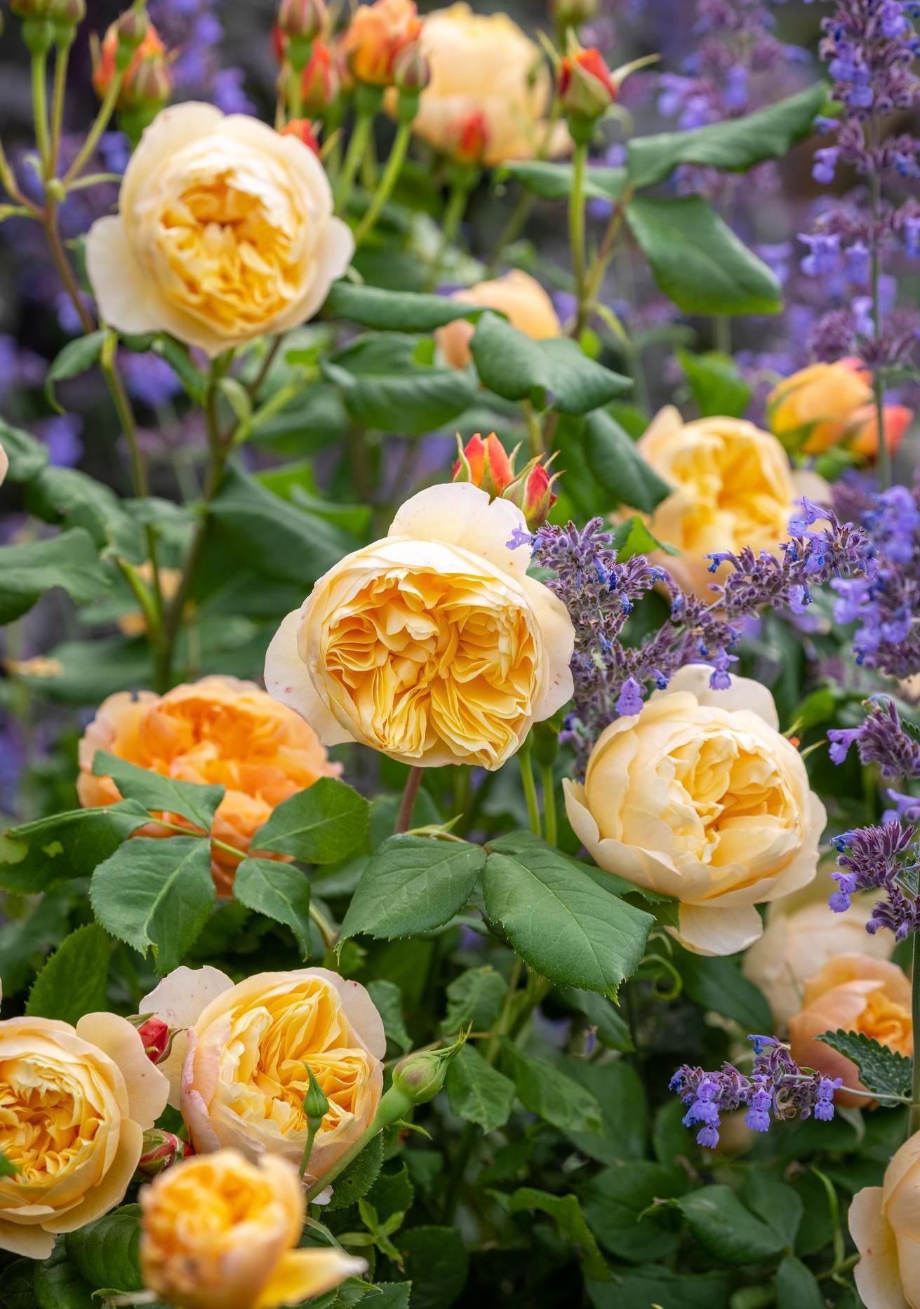
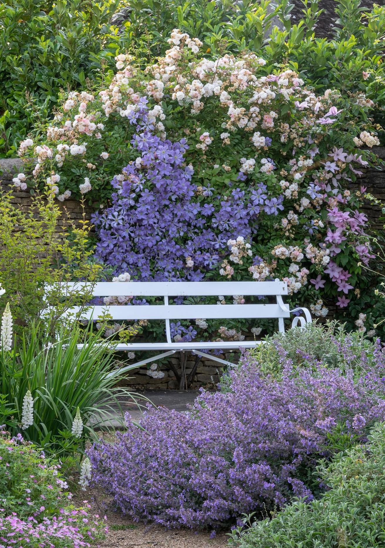
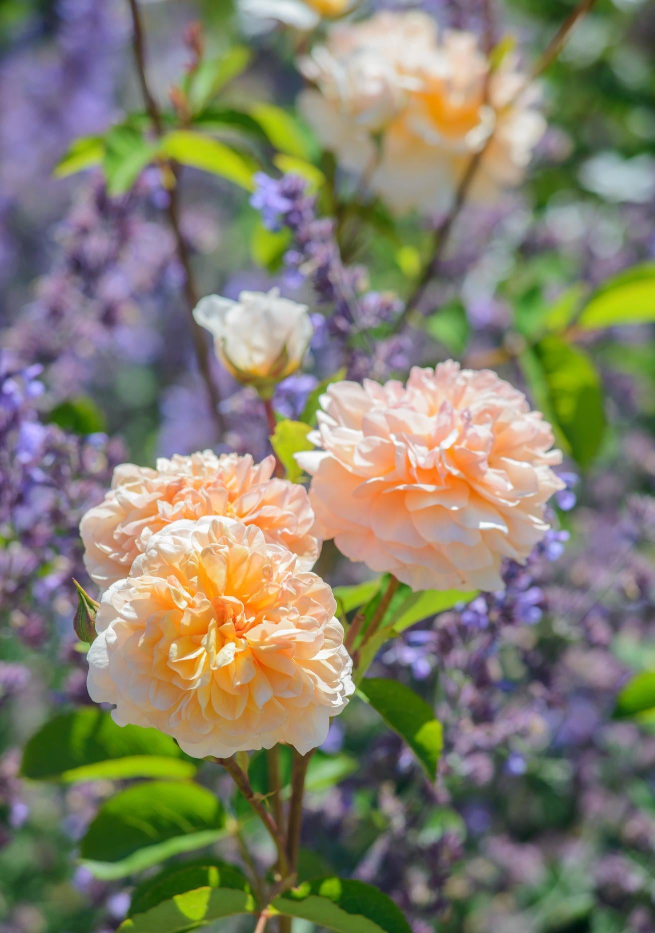
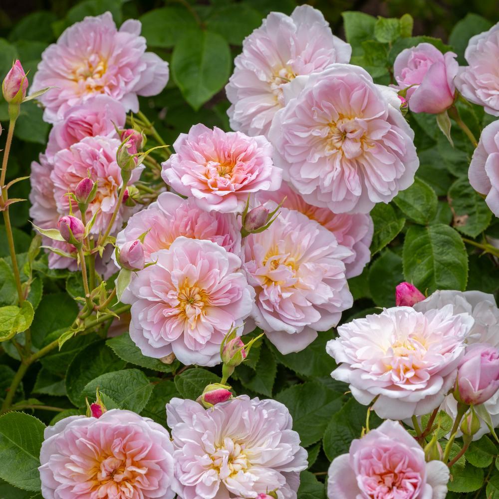
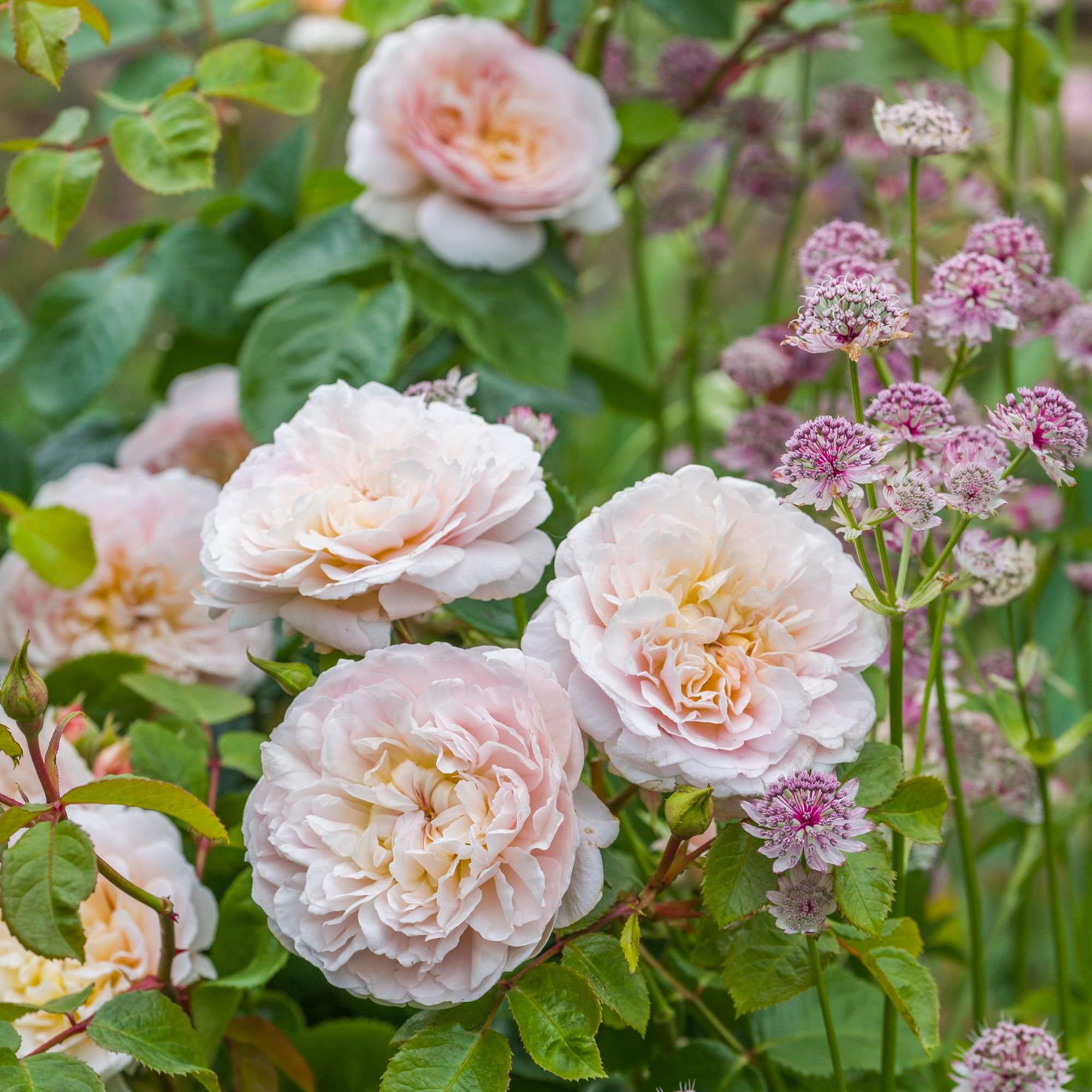
Analogous Colours: Creating Harmony
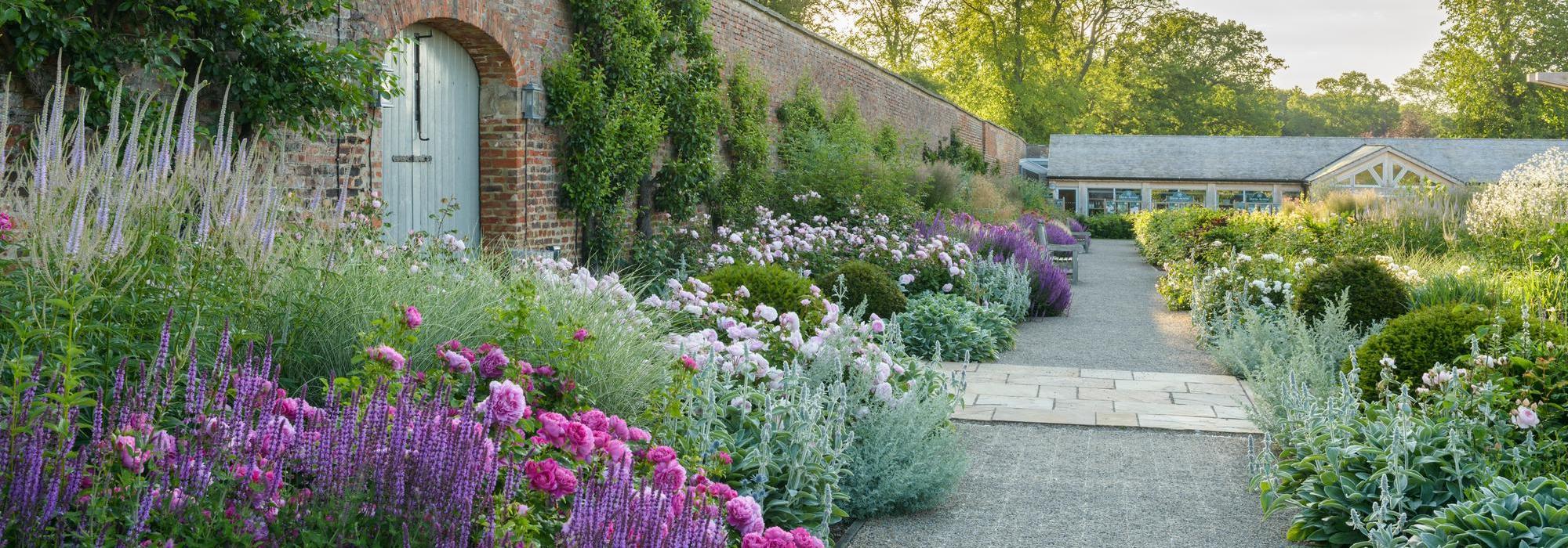
Colours that sit beside each other blend smoothly. Soft pinks flowing into peach tones and warm blush shades create a sense of continuity and calm. These combinations feel natural and welcoming, making them ideal for seating areas, long borders, and smaller gardens where unity helps the space feel larger. Rather than competing for attention, these colours support one another and allow the garden to feel cohesive and restful.
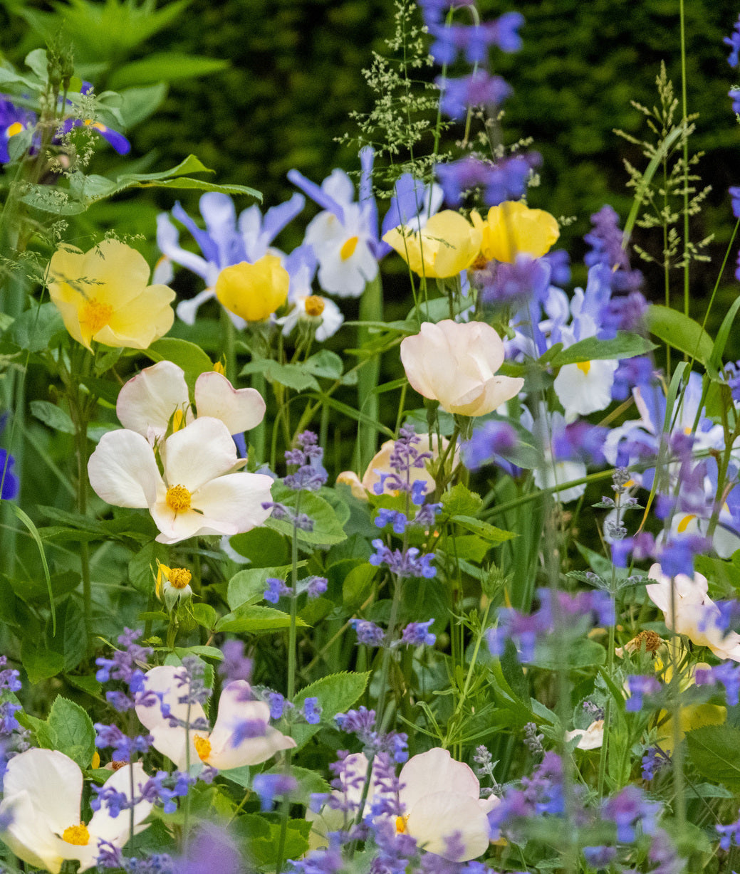
Triadic Colour Schemes: Lively but Balanced
Triadic schemes use three colours evenly spaced around the wheel, bringing energy while maintaining structure.

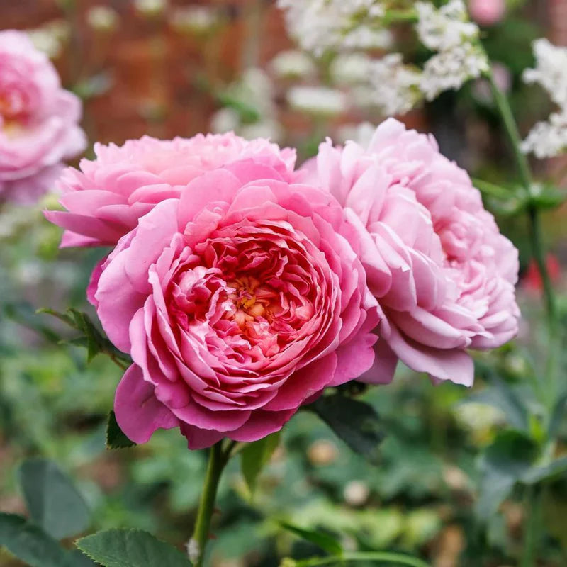
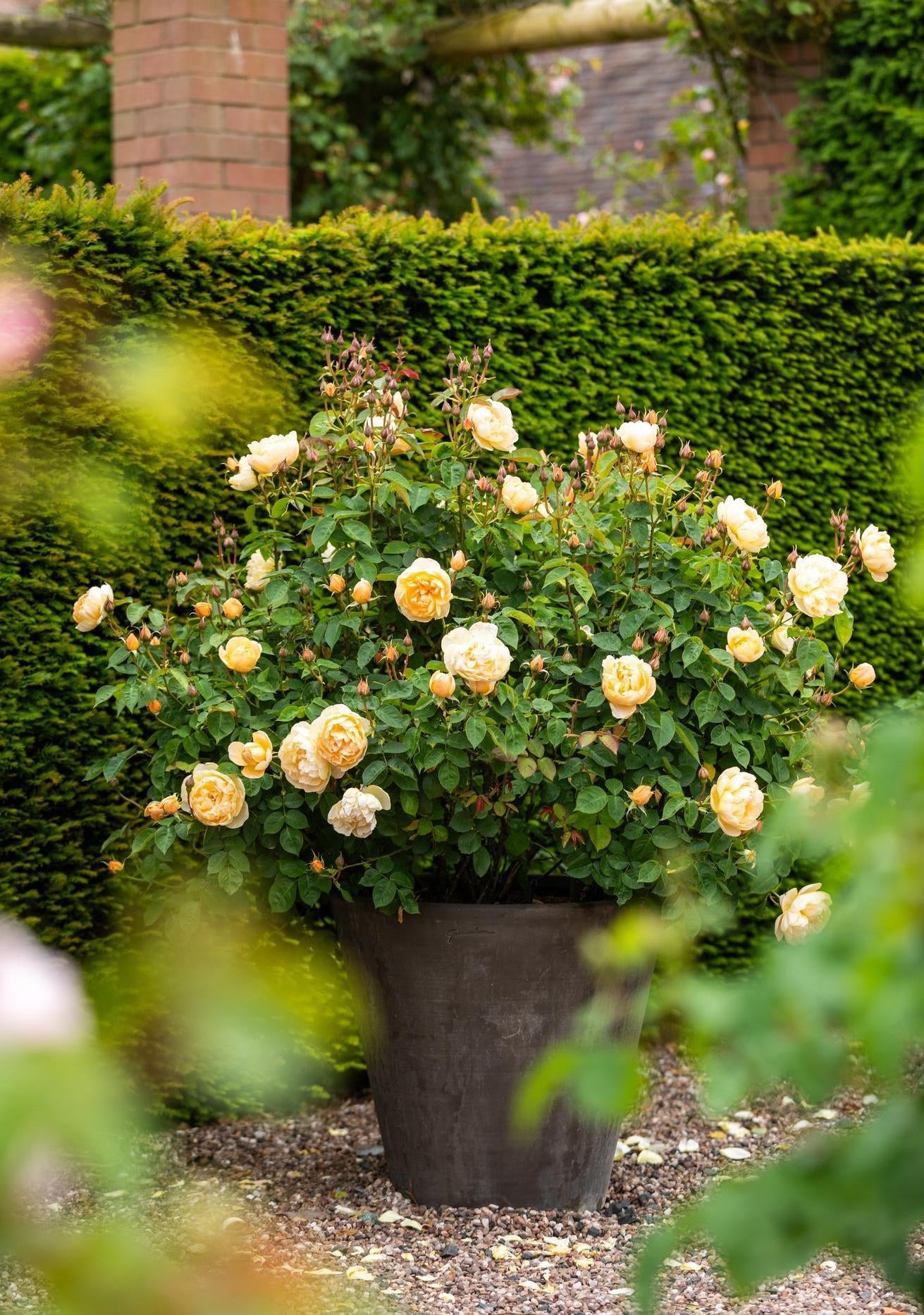
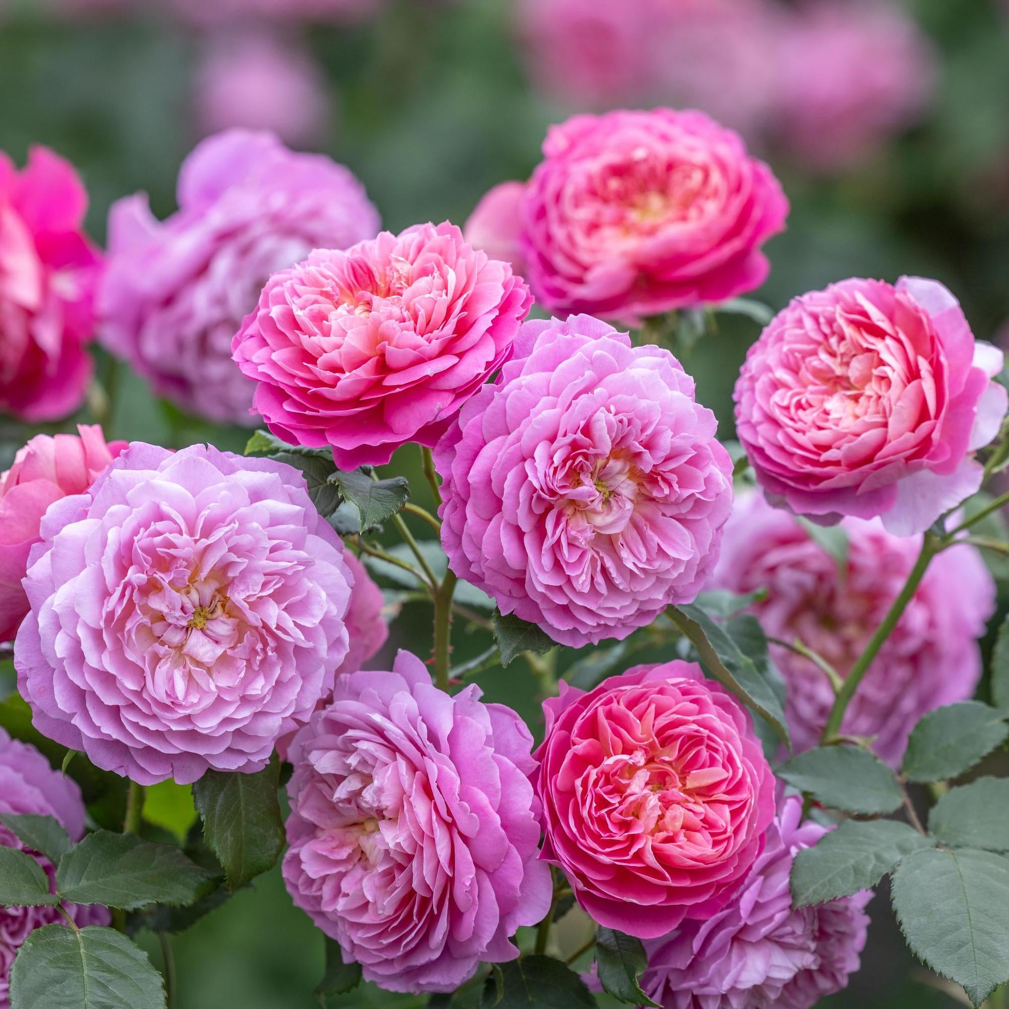
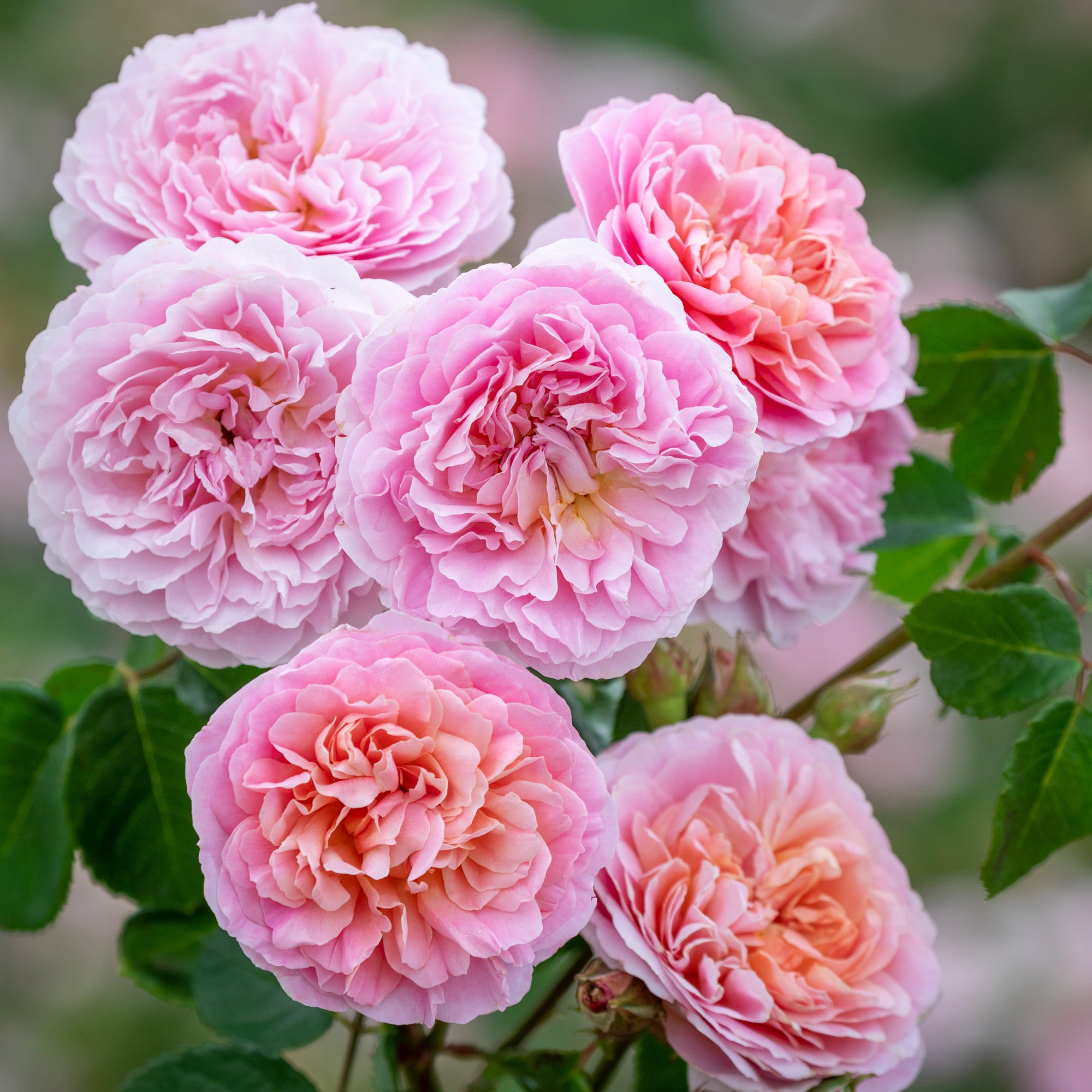
Monochromatic Planting: Depth Through Simplicity
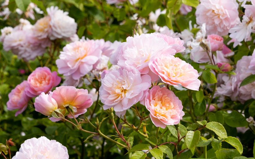
Using one colour in many shades creates elegance and depth. A garden filled with pink roses, from pale blush to deep rose, feels rich without clutter. Lighter tones toward the front of borders and deeper shades behind add dimension, while textured foliage in green or silver prevents the planting from feeling flat.
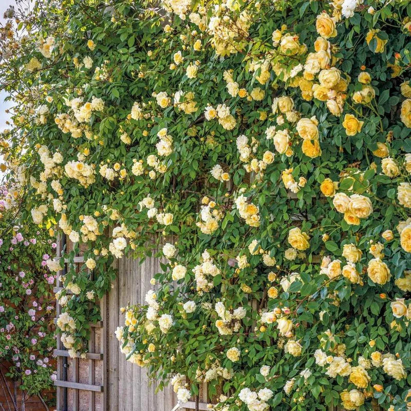
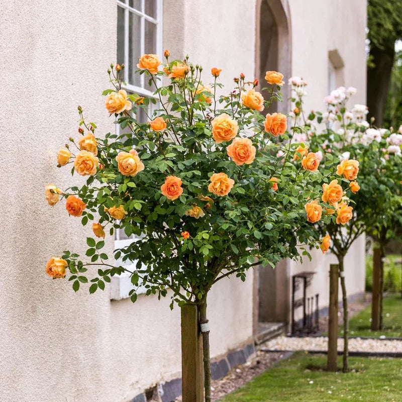
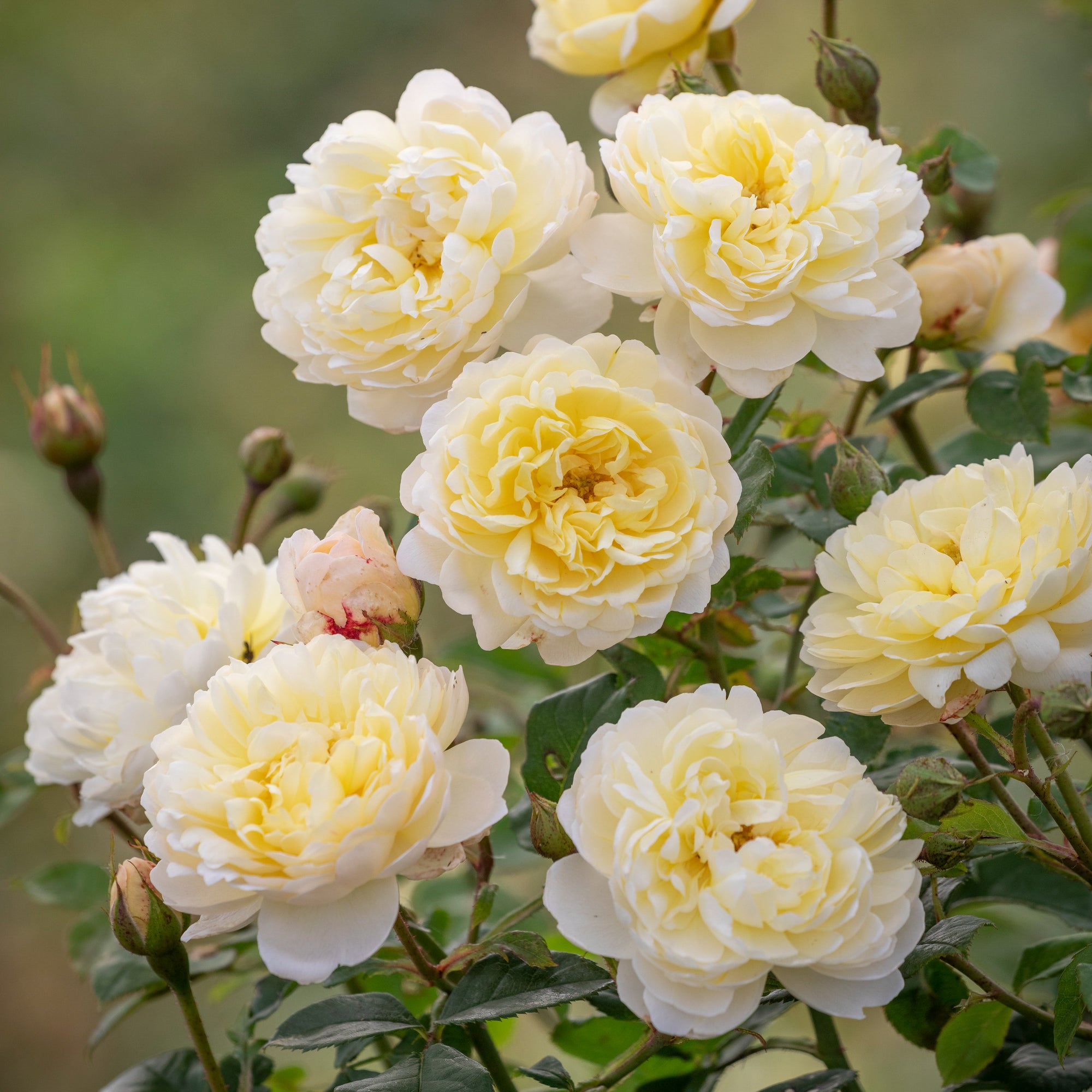
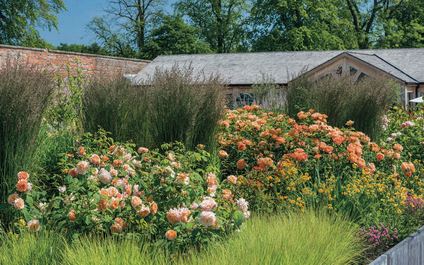
Warm and Cool Colours: Shaping Atmosphere
Warm hues such as red, yellow, apricot, and coral seem to move toward the viewer, bringing energy and welcome, perfect for patios, entrances, and social spaces.
Designing for Colour Through the Seasons
Successful colour planning looks beyond a single moment in time. Spring offers fresh greens and soft pastels, summer brings richness and vibrancy, and autumn deepens into golds and dusky purples. Choosing roses and companion plants with staggered flowering times keeps the garden alive with colour for many months.
Timeless Colour Design Tips
Repeating favourite colours across borders guides the eye naturally through the space. Foliage provides visual rest between bold blooms. Strong tones work best where attention is welcome, while softer shades suit peaceful areas. Layering heights and intensities adds depth and interest.
Colour is far more than decoration. It shapes atmosphere, movement, and emotion within the garden. With roses offering structure, fragrance, and a remarkable range of hues, colour becomes a design tool that brings balance, beauty, and lasting pleasure to every outdoor space.
-
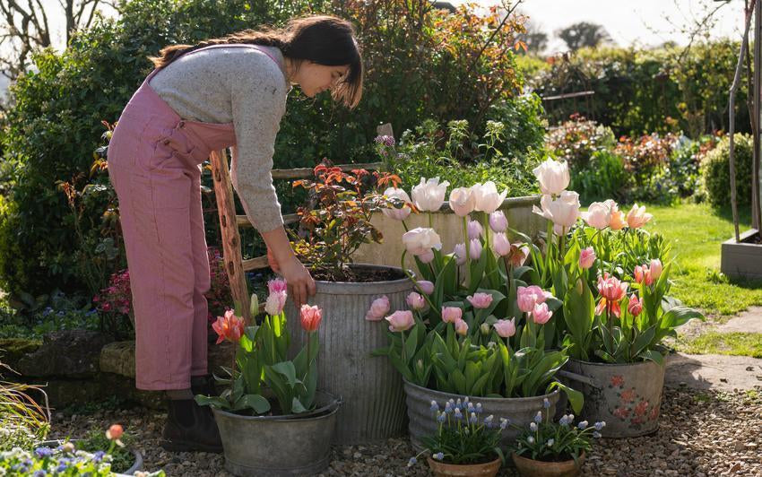
Drifts of Colour Planting English roses in threes, fives or moreWhen it comes to creating an interesting and harmonious garden, the way you arrange your plants can make all the difference. English roses, with their exquisite forms and captivating fragrances, are the perfect example. Planting them in clusters of three, five or more, particularly when you choose the same variety, is one of the simplest and most effective ways to bring both balance and character to your outdoor space.
-
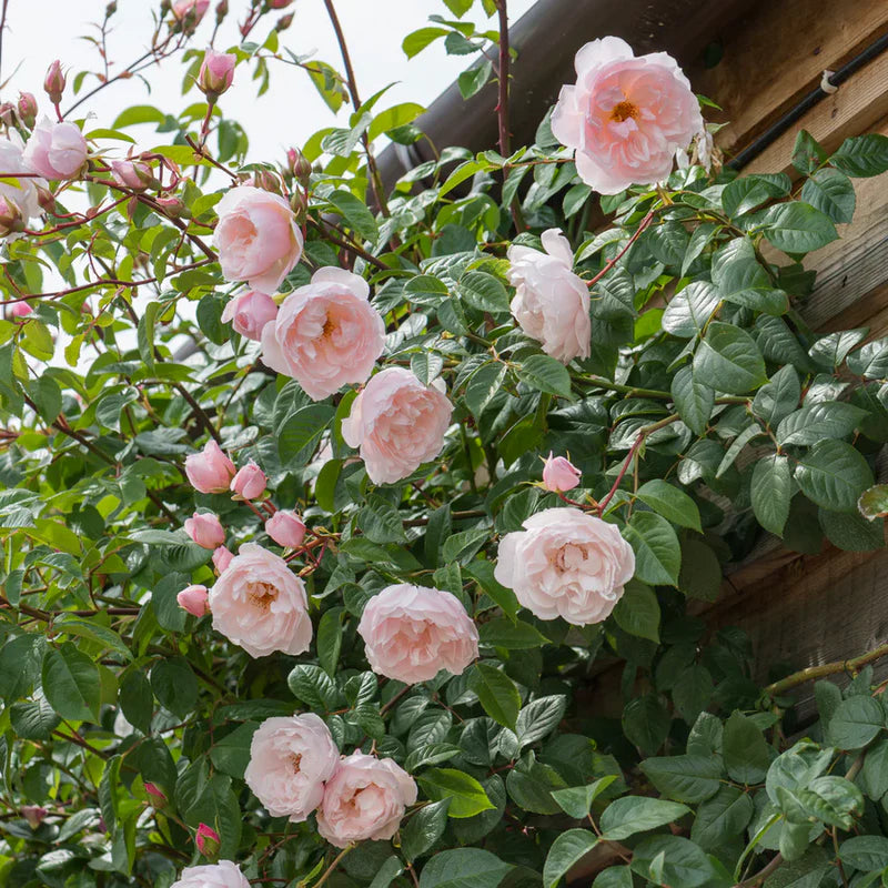
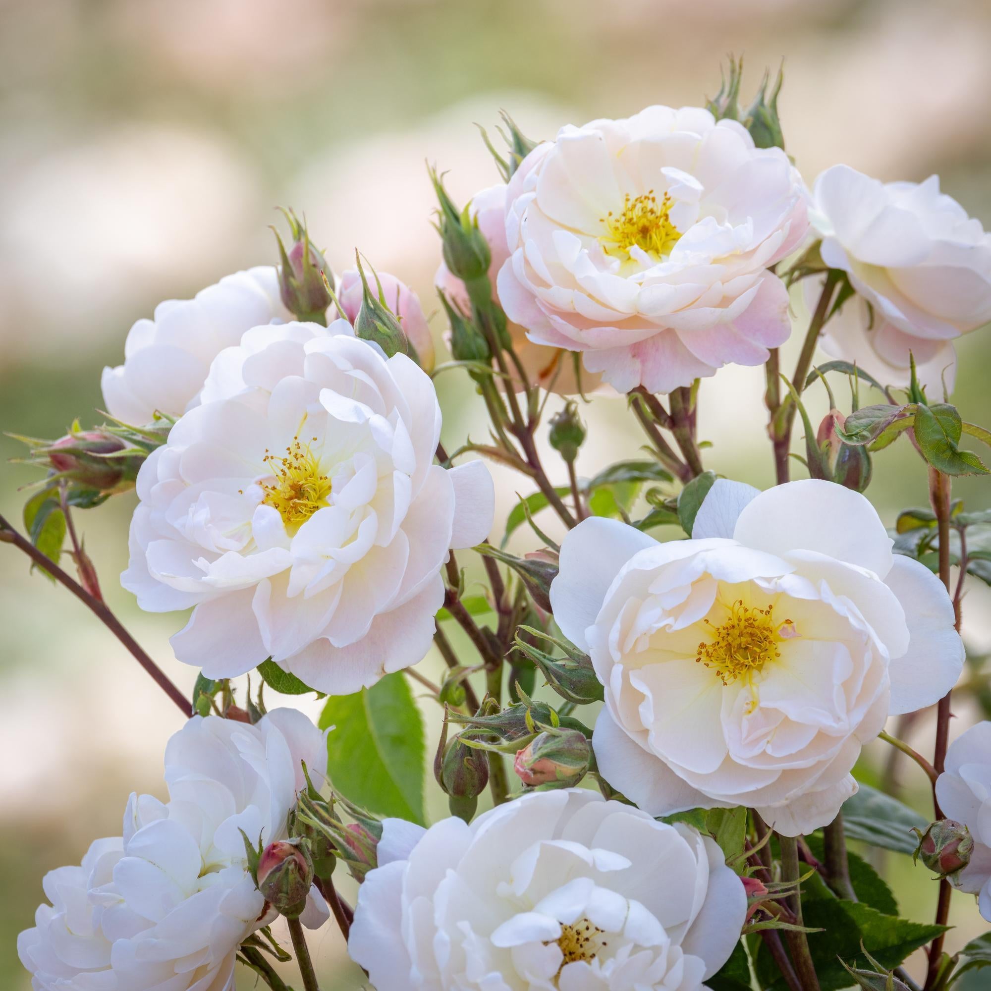
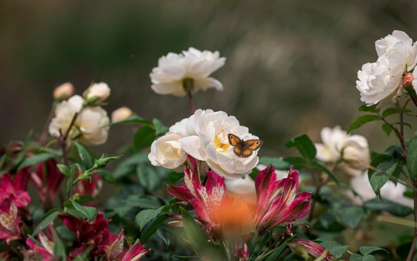
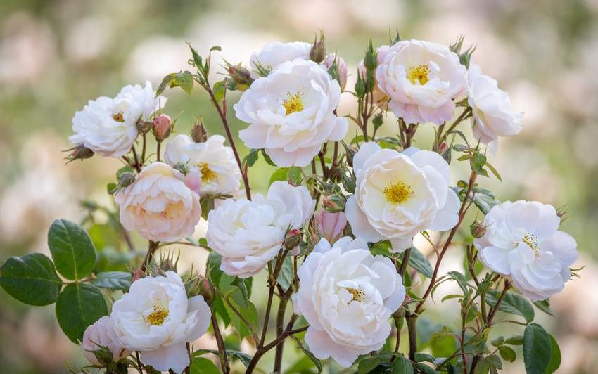
White and Cream Roses in the GardenThere is a quiet luminosity to white and cream roses. Soft yet radiant, they have a remarkable ability to lift the garden and bring a sense of calm to the planting around them. Equally at home in traditional gardens and more contemporary spaces, they offer a timeless elegance that never feels overstated. Whether woven through mixed borders, trained over old walls or planted generously in sweeping drifts, white and cream roses bring light, softness and cohesion wherever they grow.
-
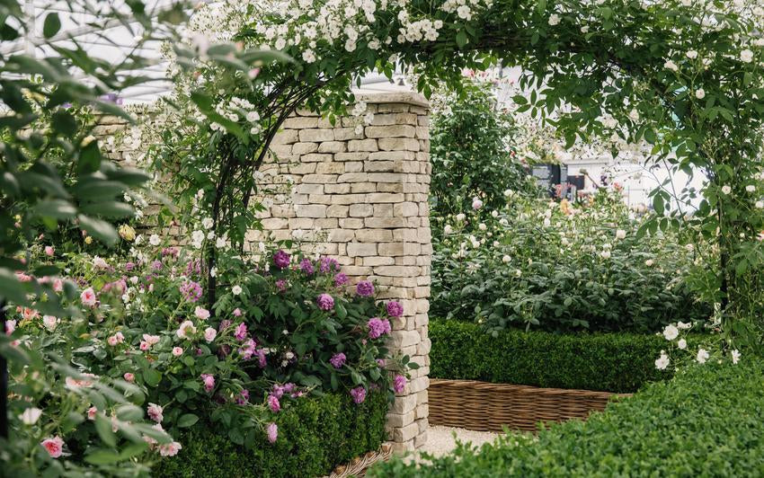
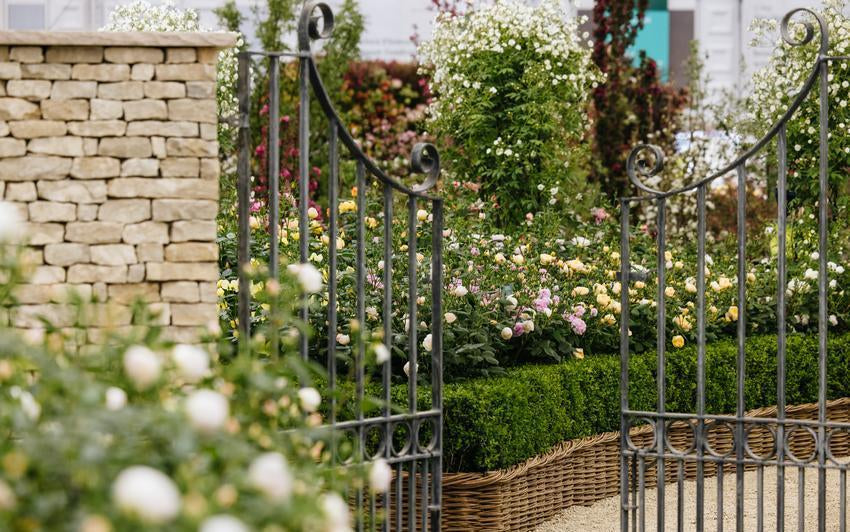
Bringing the Chelsea Look Home: How to Create Your Own Cotswold SanctuaryWalking through our garden at Chelsea is a dream, but the real magic happens when you bring that inspiration back to your own gate. You do not need a grand estate to capture the essence of The Cotswold Garden; it is more about following a few simple principles to let the roses truly shine.
-
The Cotswold Garden at ChelseaStepping into a garden should feel like a homecoming, not just a walk through an exhibit. This year at the Chelsea Flower Show, we wanted to capture that exact feeling with The Cotswold Garden. It is a space where the weight of heritage stone meets the soft, fleeting beauty of a rose in full bloom.
-
New for 2026: Sir David Beckham (Ausa34b16)Sir David Beckham (Ausa34b16) is a rose shaped by natural beauty, quiet strength and a deeply personal story. Created to mark a milestone year and inspired by a touching request from Harper for her father’s 50th birthday, this remarkable new English Shrub Rose is rooted in something deeply meaningful, a living symbol of family, resilience and enduring love. Yet beyond the story behind its name, Sir David Beckham is, above all, a rose of great garden beauty and presence.
-
David Austin at Chelsea: A Look Back at Our Five Most Recent Rose LaunchesAs Chelsea draws near once more, so too does that unmistakable sense of anticipation. Each year brings with it something new, but never something hurried. Every David Austin® rose released at Chelsea represents years of patience, often requiring more than a decade of careful breeding, observation and quiet conviction.
-
Demystifying the Rose: Why Anyone Can Grow ThemThere is a long-standing myth that roses are high-maintenance or best reserved for the experienced gardener. In reality, roses are some of the most resilient and rewarding plants you can introduce to your garden. National Gardening Week is the perfect moment to look at them a little differently - not as a challenge to be mastered, but simply as a beautiful plant to begin with.